WRITINGS ON THE WALL
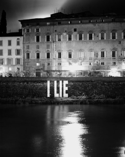
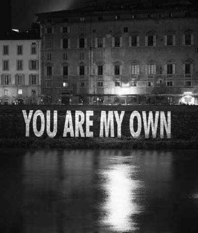
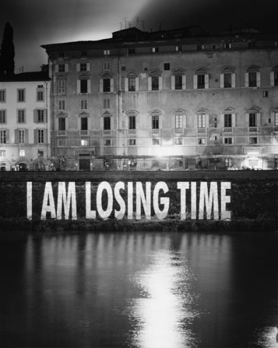
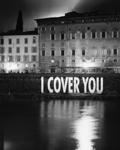
I first heard of Jenny Holzer when she was chosen to represent the U.S. at the Venice Biennale back in 1990, before she started making her signature projections. I can’t vouch for how these 1996 projections (in Florence) looked in person, but as black & white photos, they’re pretty arresting.
CHILD’S PLAY
31 March 2009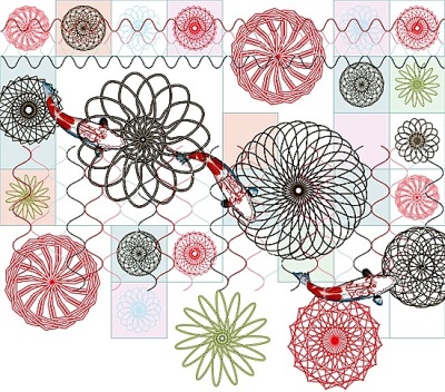
As a little girl, I was fascinated by the shapes and colors I could create with my spirograph. Dutch designer Edward van Vliet may have the same affinity. His sushi furniture collection for the Italian manufacturer, Moroso, showcases a colorful patchwork of fabrics distinguished by these unmistakably intricate and symmetrical marks.
THE DOORS
30 March 2009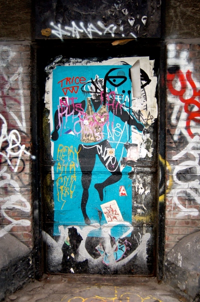
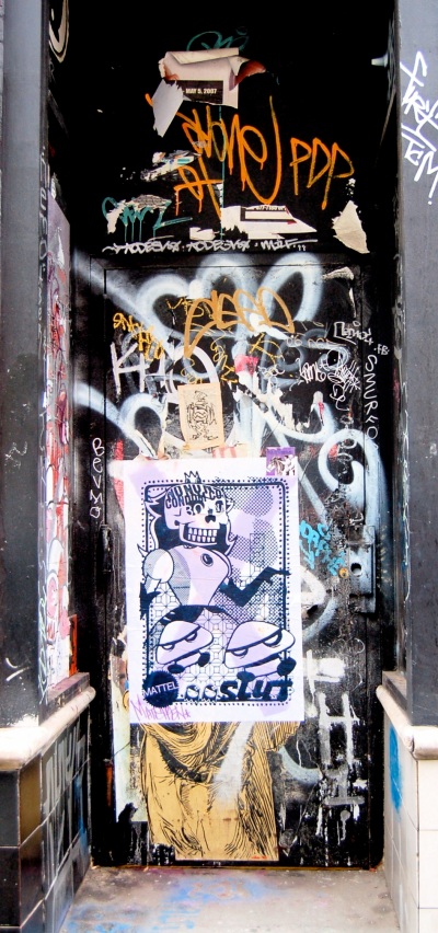
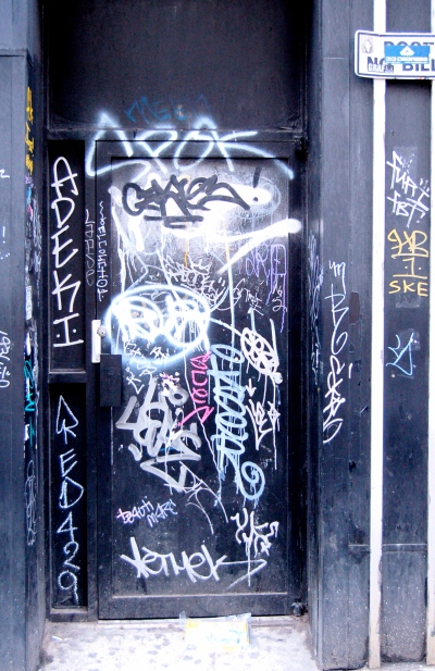
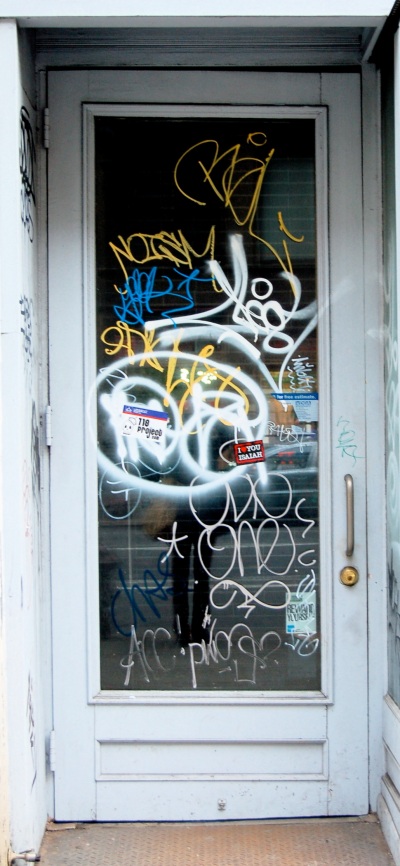
On Sunday, a sleepy, somewhat overcast day, I took a stroll through Soho, and noticed a distinct resurgence of graffiti in the neighborhood, mostly on shuttered storefronts and a couple of abandoned construction sites. Doorways, in particular, seemed to be the target , some obviously older, well-burnished surfaces, while others targets of more recent marks (and signals?) of the times.
OFF THE CHARTS
30 March 2009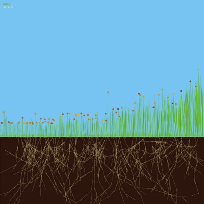
This may be the most beautiful bar graph ever created. Jer Thorp, an artist and former geneticist, creates software-based images called visualizations. The image, above, illustrates how often the word ‘organic’ appears on the pages of the New York Times between the years 1981 and 2009. Each blade of grass represents a one-month period, showing a gradual rise in the use of the term over the last two decades.
PEACE SIGN
30 March 2009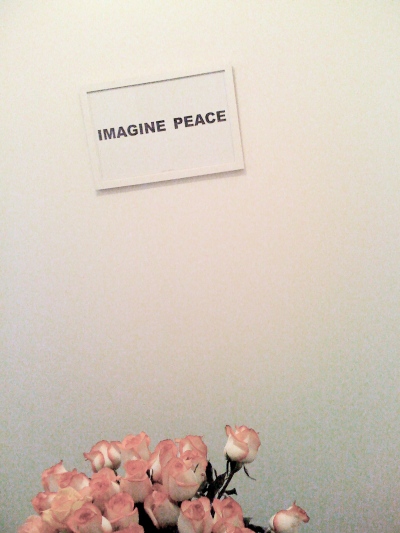
I liked the juxtaposition of this Yoko Ono poster on my wall with the roses on the table below it, taken with my iPhone. I seem to be inexplicably drawn to tilted shots, objects (and life?) on the bias.
GOING DUTCH
30 March 2009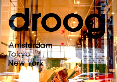
The Dutch design collective, Droog (‘dry’ in Dutch), has been designing quirky and unexpectedly winsome furniture and objects since 1993. Now, they’ve finally arrived in America. The first Droog retail shop in North America opened last week on Greene Street in Soho.
CUTTING EDGE
28 March 2009
Design for the Art Museum Strongoli in Calabria, Italy, by Austrian architects Coop Himmelb(l)au. Situated atop the ‘Motta Grande’ hill overlooking the city, the edifice “is a composition of three main elements: the emblematic, cone-shaped construction with the entrance orientated towards the city, while the cantilevering restaurant at the opposite end of the building offers a panoramic terrace facing the sea in the east…both linked by a two-story exhibition volume.”
PILLOW TALK
27 March 2009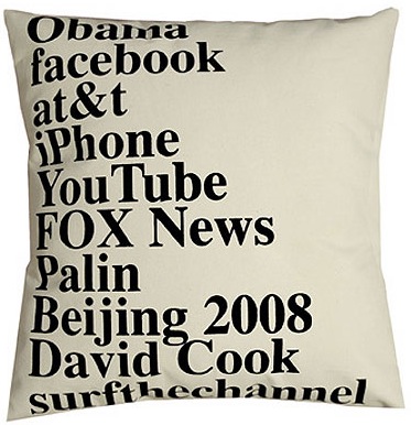
Since 2005, the Brooklyn-based textile studio, elastiCo, has been silkscreening the top Google searches for each calendar year onto decorative throw pillows. Each year’s version is signed and numbered in an edition of 250.
NAMES SAKE
27 March 2009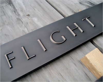
After a protracted and arduous process, Optima was chosen as the official typeface for the World Trade Center Memorial, on which the names of every victim will be inscribed. The New York Times’ slide show revisits the devil in this detail.
GOING WEST
27 March 2009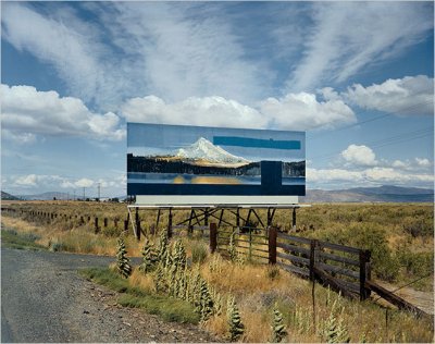
Stephen Shore has been taking photographs of the American landscape since the 1970’s. This one was taken along Route 97 in Oregon in 1973, and is included in Into the Sunset: Photography’s Image of the American West, at the Museum of Modern Art. The show opens today.
Δεν υπάρχουν σχόλια:
Δημοσίευση σχολίου